
Page updated: 22 November 2011
 Applying
A Name
Applying
A Name
You don't need to find a professional sign writer to paint on a boat name these days, but should you choose vinyl lettering don't turn to the Web assuming that suppliers there will always be cheaper than a local company. Owners in both the Lake District and the Broads can confirm that local sign makers can prove to be much cheaper.
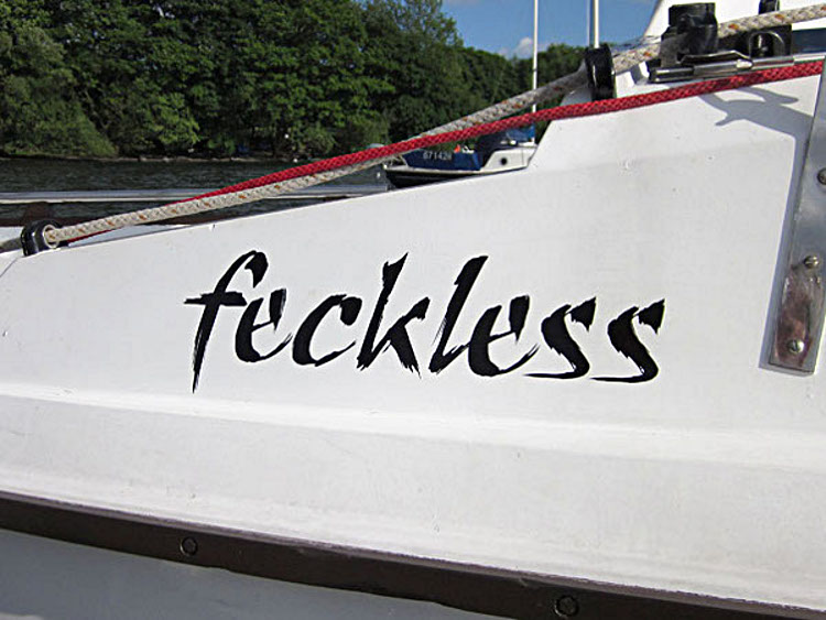
If you plan to site the name on the cabin sides, as in Feckless'
case, do your measuring on the starboard side of the boat when
deciding on the size of the font. This is important if you are
planning to make it as big as possible. If your name includes upper
case and lower case letters with descenders you might find the
lettering that looks good on the port side appears squashed or has
to be moved forward in order to fit when placed on the Starboard
side.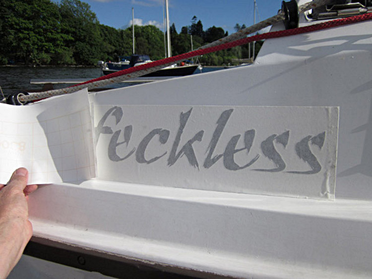
In 2010 the owner of "Feckless" sent a local sign maker a .jpg file. He cut the name from vehicle graphic vinyl. The sign was supplied on a carrier backing paper with a removable low-tack front sheet. In Feckless' case this was white, but others could supply a clear front sheet. The cost was £10.
To fit the name, you line it up and tack it on with a couple of
tabs of tape (masking tape will do) then peel off the backing sheet
from between the name and the grp...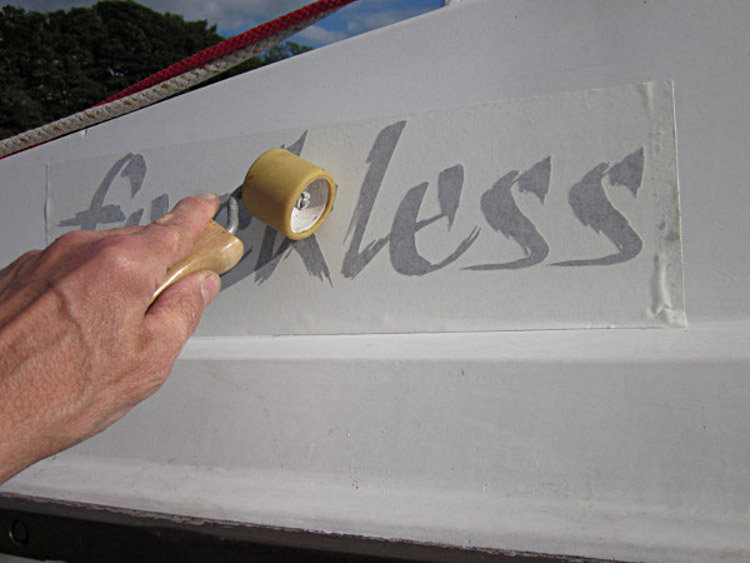
The letters are adhesive so you can smooth them on by hand, but it can be worth using a decorator's edge roller, or something similar, over the front sheet to ensure a good bond.

Finally, the lighter tack front sheet is carefully peeled away to reveal the name.
SeaHawk
Insignia
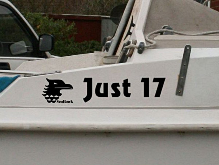
When Broadland owner, Greg Chapman, renamed his boat he decided to add a SeaHawk logo at the same time. He reported:
I took an .svg file on a memory stick to my local sign maker. They had the font I had chosen available on their computer, so there was no problem with the boat name lettering. However, there was a problem with the graphic. Initially, the file was imported improperly to the sign maker's software. A vertical cut created in the vinyl which produced a set of tiny triangles at the ends of the feathers on the back of the SeaHawk head. They re-made the heads but not the "SeaHawk" text, so those two components were separated from the graphic. That led to some extra care being needed when aligning the three parts. boat name, graphic and class name, but otherwise all was well.

In Greg's case, the vinyl was produced on single backing sheet under separate transparent front sheets. Greg continued:
In creating the design and choosing the font I used a photograph I had of another SeaHawk. This showed the cabin side at right angles. I superimposed mock ups of the proposed layout of the text and graphics on each side of the boat.
I was concerned about how the alignment of the graphic and text would affect the overall appearance. In fact, I think the port side looks better, because the "ust 17" is nicely framed by the "J" with its descender and the graphic, both of which are the same height and drop the same distance below the baseline of the central text.
When I first thought about it, I considered placing the graphic on the hull in the same position I had seen that Graham Richards had done on his boat "Coren'grato". There the logo could be larger, around 150mm tall, but I ended up specifying that the height of the "J" and graphic should both be 100mm and put them both on the cabin side.
The photograph used for the name mock up is of Hakuna Matata which can be seen in the Gallery Section.
Graham Richards works at his local boatyard on the Great Ouse. Whether it was because few people recognise a SeaHawk there, he didn't say, but he decided to have some impressive decoration made up that he has applied to the hull of his boat.
"I had it made to echo the colour scheme and shape of the original sales brochure." said Graham, when it was pointed out that the insignia doesn't quite match the emblem normally found on SeaHawk sails.
Graham ordered a number of sets of the decoration and is prepared to sell his spares. If you would like to know more, get in contact via the The Forum.
SeaHawk Logo
When the comment was made, a few years ago, to Graham Richards (See above) that his logo on his graphic didn't match the normal sail emblem, it was assumed that Jeckells had always produced an identical symbol. However, it is now known that over the years it has varied slightly. The examples below show, the logo that appeared on the original 1973 sails of #267 and, with more separated feathering on the neck, that on the replacement sails bought in 2005.
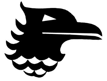
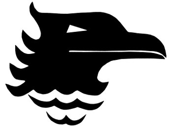
Now that we have available the 1970 sales brochure, the inspiration for the sail logo can be seen. It echoes the large blue outline image on the front cover (below), rather than the one seen on the back cover, which was the version used on the later brochures and used by Graham.

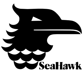
The logo seen above is the version produced by Greg Chapman and is an attempt to capture the best features of the various examples seen to date and does not need to retain the "SeaHawk" text, the font for this being taken from the later brochures.
The main features of this version of the logo are:
- The semi-circular curves under the beak and top feather on the back of the head
- The eye has a horizontal bottom edge and is larger than in some versions
- The beak slit starts just forward of the back of the eye and exits on the lower edge of the beak.
- The lower beak has the narrow form of the sail emblem
- The tips of the two rows of neck feathers all touch the curves of the feathers above
- The two rows of neck feathers are deep, echoing those seen in the more recent brochures
The SVG file from which the image above was derived is available for download and may be passed to your sign or sail maker. The advantage of the SVG (Scalable Vector Graphics) format, as you can guess from its name, is that it can produce output at any size. The image will not develop jagged edges or pixelate when enlarged. Most recent vector graphic software should be able to read the file allow you to flip the image for port and starboard use or remove or reposition the text.
Download the SeaHawk Logo in SVG format.